
Lunchbox Pediatrics
BRANDING
Lunchbox Pediatrics is a concierge direct primary care practice in Bee Cave, Texas, that needed a full brand identity balancing clinical credibility with high-end charm — an identity that feels bright and approachable for kids while appealing directly to style-conscious parents in affluent Hill Country communities.
ROLE
Designer
TOOLS
Illustrator
The Challenge
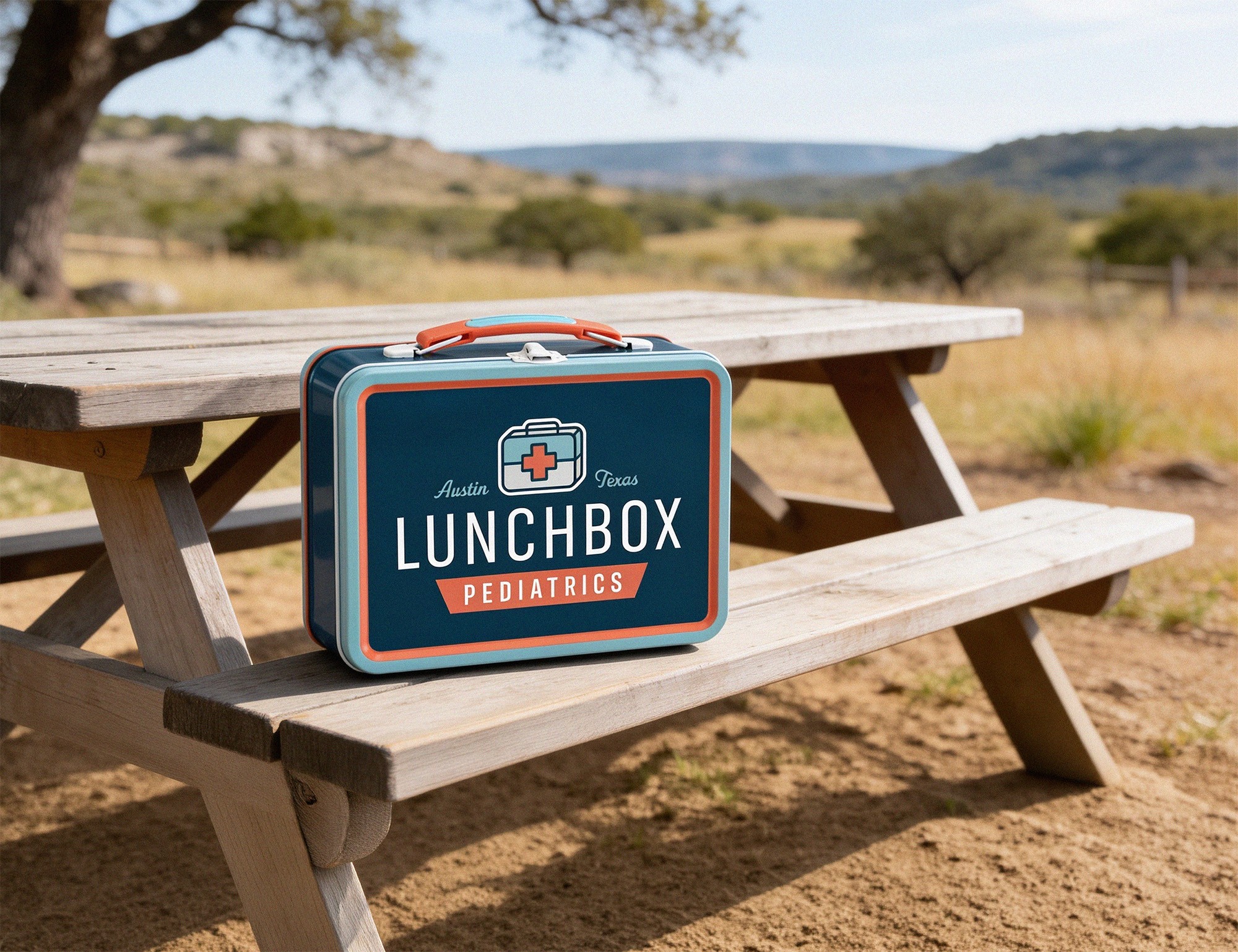
Most pediatric clinics lean into cold, sterile environments that treat care like a corporate transaction, while child-focused spaces often lack the elevated polish expected by affluent parents. Lunchbox Pediatrics needed a brand with distinct local warmth that could appeal directly to style-conscious mothers in Bee Cave, project high-end clinical authority, and still feel inviting to young patients. Visually, the mark had to bridge both worlds by merging the retro nostalgia of a classic lunchbox with clear first-aid medical iconography.
The Solution
We created an identity system rooted in an "elevated nostalgia" brand direction. Blending Old Austin visual warmth with modern, clean line art and approachable typography, the brand contrasts clinical professionalism with a relaxed, local feel. The system instantly communicates high-value services and trust for parents, while keeping the experience playful and inviting for the kids receiving care.
PILLAR 1
Personalized Care
Moving away from insurance hassles and rushed appointments, the brand highlights direct access to dedicated professionals, positioning as a personal relationship rather than a corporate transaction.
PILLAR 2
Nostalgia & Warmth
Leaning into an Old Austin nostalgic vibe, the visual identity uses bright retro colors to add warmth and a playful charm to make medical visits feel welcoming, local, and human for all guests, kids and adults.

The Brand Kit
The identity balances a professional yet subtly playful visual personality, pairing clean linework with custom iconography. The typography contrasts a crisp modern sans-serif for high legibility across all touchpoints with an approachable, nostalgic display font that carries character and personality throughout the brand. Paired with a bright, eye-catching, and inviting color palette, the entire visual system feels lively, elevated, and personal.

Reflection
Lunchbox Pediatrics needed to strike a careful balance between high-end concierge pediatric care and a warm, child-friendly environment. By pairing a retro Austin aesthetic with modern design structure, the identity establishes instant professionl and personal credibility with parents while remaining comforting and inviting for kids. The resulting system gives the practice a distinct, memorable presence built to stand out against the sterile environments of the local market.